Tuesday, February 28, 2012

Emphasis

For this assignment we were asked to choose an image and pick one aspect of the image to emphasize using color or value. I found this image of a little girl and was immediately captivated by the color of her eyes and lips. I knew right away that I wanted to emphasize them.

Orginal Image:
After Emphasizing:

I worked in photoshop to edit this image. I decided to use color and value when editing this picture. As our book states, Color is an extremely effective tool when it comes to making one element stand out above others and value (the relative light-to-dark measure of a specific hure) can also be used to bring notice to one element above others. I made the entire photo black and white except for her eyes and lips, I think this really makes the colors pop.

Alignment

This assignment require us to recreate an image from the book located on page 85. It is a flyer created from furniture and the design feature a lot of specific alignments. The following is a description of the original flyer from the book, "Strict alignment need not appear stodgy. Nearly every element in this composition is tightly anchored to a horizontal or vertical detail of another element. A creative application of the rules of alignment can lead to a dynamic conveyance of variety and verve."

I redesigned the flyer but kept to the same alignment techniques that were used in the original. However I used shoes instead of the chairs that were used in the original. I chose a bright colored pump that would easily stand out with the different colored backgrounds. I kept the two columns of text equally aligned and spaced. The titles on the page are also aligned with the edges of the columns of text. I wanted the word PUMPS to really stand out so I made the letters very large and I stretched them across the entire width of the page. I used the colors from the images on the right for the different words and lettering in the headings.

Harmony

For this assignment we had to choose a subject such as history, math, language, technology, social studies, etc and pick a simple concept to teach someone in that area. We were asked to demonstrate harmony using repetition and visual echo through at least one of the following: color, style, content, or typography.

Monday, February 27, 2012

Personal Poster


We were asked to create a poster about ourselves using photoshop. I chose all of my favorite things in my life including my family, my friends, going on vacations, and my sorority, Delta Delta Delta. I decided to make the deltas the main aspect of my poster because I knew I would be able to place pictures inside of them. The colors of my sorority are blue and yellow so I stuck to this color scheme for the entire poster.

Thursday, February 16, 2012

After being given the above assignment I created the following poster:


After being asked the create a poster using a word or a few words that describes us, without writing that word on there I created this poster. I decided to use a phrase instead of a word that I feel describes me. I created this using Powerpoint so it is very simple but I like the outcome. I stuck to one color theme and I love the way it looks!

Wednesday, February 15, 2012

Grouping Practice

In class we were given the above assignment. After reading the instructions, I created the following slides using only one basic shape on each slide:
For the word "unity", I used 10 different circles to create a pyramid. I think pyramid's a symbol of unity, and when making a human pyramid, it requires a lot of cooperation and work from everyone.

In order to represent "celebration", I used squiggly lines of all different colors and sizes to represent confetti.

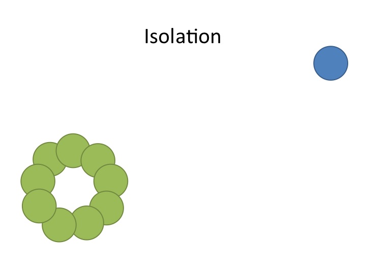
To represent the word "isolation" I used 10 different circles, 9 of which were green and 1 of which was blue. I created a circle with the 9 green circles in the bottom corner, and placed the blue circle way off in the upper corner to show that it was being isolated.

In order to make an image representing the word "escape" I used 10 different wavy rectangles. I made them all blue and made each one a different size. I wanted them to represent little fish escaping, so I put them all of the one side of the slide, making it appear as if they're about to swim off the page.

To create a slide representing "intimidation" i used 10 different cylinders. I made one of the cylinders large and colored it black and I made the other 9 very small and purple. The large black one is towering over the group of purple ones to appear intimidating.

I had a hard time coming up with a slide to represent "logic". Finally, I decided to use 10 red and green squares in a checkerboard pattern to represent order and logic.

To create a slide to represent "anarchy" I used 10 different lighting bolt shapes. I made each of them either yellow, orange and red to represent fire and they are all different sizes. I think this shows chaos and anarchy.